Re:Fresh are a digital label remastering deep house music tracks from the original production DATs and with the support of the original artists.
Design Brief
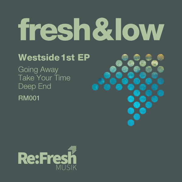
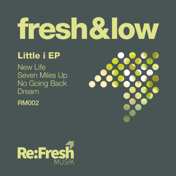
They approached us to design their branding which they wanted to be bold, clean and mainly text as it had to stand out among all the other digital labels on the relevant stores. We were then asked to design the covers of their releases which included the branding. They wanted these to have some sort of abstract image for each one and the colours to be different though also to have continuity between releases.
What We Did
We came up with a few ideas and then ran with the current one as it stood out and with the small arrow heading upwards gave a sense of going forward. Using the circle within the arrow lent itself for other creative ventures within the label cover itself, and also denoted a disc as in a record. In the releases we used the arrow graphic to display the abstract images as the layout could be the same with only the colours and image different.
Outcome
Re:Fresh were happy with the design and are using the branding and cover design successfully on the releases so far within relevant store front websites and their own website.
“Ecru design listened carefully to what we wanted and came up with various great ideas before working further on the one chosen. They are a delight to work with!”